How to draw charts in Octave/Matlab
Intro
The main role of the charts is to present data in an easy-to-understand way. Consider the chart below. This chart does not help in understanding the data, because we don’t know what’s supposed to represent.
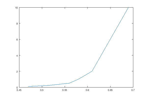
i_d = [0.1  0.2  0.5  1    2    5    10  ];
v_d = [0.47 0.51 0.56 0.58 0.61 0.64 0.69];
plot(v_d, i_d);
print('basic.png', '-S600,400');
The labels
On every chart, the axes must be labeled. Each axis must specify the property that’s being measured and the unit. Otherwise, the chart will be useless, as it cannot be correctly interpreted. Example:
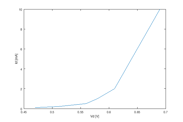
i_d = [0.1  0.2  0.5  1    2    5    10  ];
v_d = [0.47 0.51 0.56 0.58 0.61 0.64 0.69];
plot(v_d, i_d);
xlabel('Vd [V]');
ylabel('Id [mA]');
print('labels.png', '-S600,400');
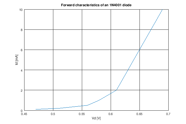
The title
Along with the labels on the axes, it’s useful to add a title, to explain what the chart represents.
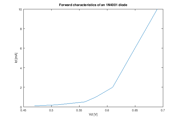
i_d = [0.1  0.2  0.5  1    2    5    10  ];
v_d = [0.47 0.51 0.56 0.58 0.61 0.64 0.69];
plot(v_d, i_d);
xlabel('Vd [V]');
ylabel('Id [mA]');
title('Forward characteristics of an 1N4001 diode');
print('title.png', '-S600,400');
The legend
If the chart contains multiple datasets, those must be presented using different colors (or signs), and the datasets must be labeled in a legend. The legend must be placed such that it does not overlap the datapoints.
Wrong way:
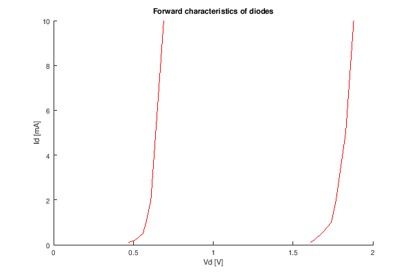
i_d   = [0.1  0.2  0.5  1    2    5    10  ];
v_d   = [0.47 0.51 0.56 0.58 0.61 0.64 0.69];
v_led = [1.61 1.63 1.68 1.74 1.77 1.83 1.88];
hold all;
plot(v_d, i_d, '1');
plot(v_led, i_d, '1');
xlabel('Vd [V]');
ylabel('Id [mA]');
title('Forward characteristics of diodes');
print('wrong.png', '-S600,400');
Right way:
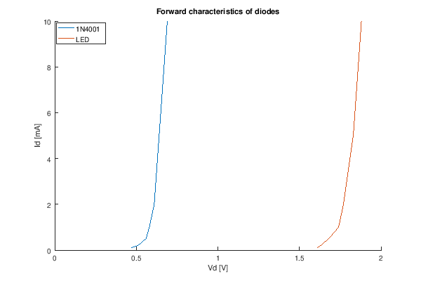
i_d   = [0.1  0.2  0.5  1    2    5    10  ];
v_d   = [0.47 0.51 0.56 0.58 0.61 0.64 0.69];
v_led = [1.61 1.63 1.68 1.74 1.77 1.83 1.88];
hold all;
plot(v_d, i_d, ';1N4001;');
plot(v_led, i_d, ';LED;');
xlabel('Vd [V]');
ylabel('Id [mA]');
legend('location', 'northwest')
title('Forward characteristics of diodes');
print('right.png', '-S600,400');
The grid
As the data-points go further from the axes, it’s getting harder to appreciate their coordonates at a glance. This is why charts use grids.
Example:
i_d = [0.1  0.2  0.5  1    2    5    10  ];
v_d = [0.47 0.51 0.56 0.58 0.61 0.64 0.69];
plot(v_d, i_d);
xlabel('Vd [V]');
ylabel('Id [mA]');
title('Forward characteristics of an 1N4001 diode');
grid on;
print('grid.png', '-S600,400');
Better example, with lighter grid lines:
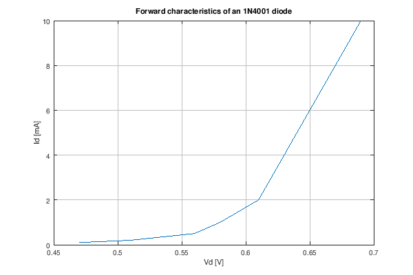
i_d = [0.1  0.2  0.5  1    2    5    10  ];
v_d = [0.47 0.51 0.56 0.58 0.61 0.64 0.69];
plot(v_d, i_d);
xlabel('Vd [V]');
ylabel('Id [mA]');
title('Forward characteristics of an 1N4001 diode');
set(gca, 'GridColor', [0.75, 0.75, 0.75])
grid on;
print('better-grid.png', '-S600,400');
Datapoints
If the chart contains both measured data and simulated/interpolated data, the measured datapoints must be marked:
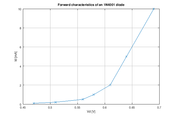
i_d = [0.1  0.2  0.5  1    2    5    10  ];
v_d = [0.47 0.51 0.56 0.58 0.61 0.64 0.69];
plot(v_d, i_d, 'x-');
xlabel('Vd [V]');
ylabel('Id [mA]');
title('Forward characteristics of an 1N4001 diode');
set(gca, 'GridColor', [0.75, 0.75, 0.75])
grid on;
print('datapoints.png', '-S600,400');